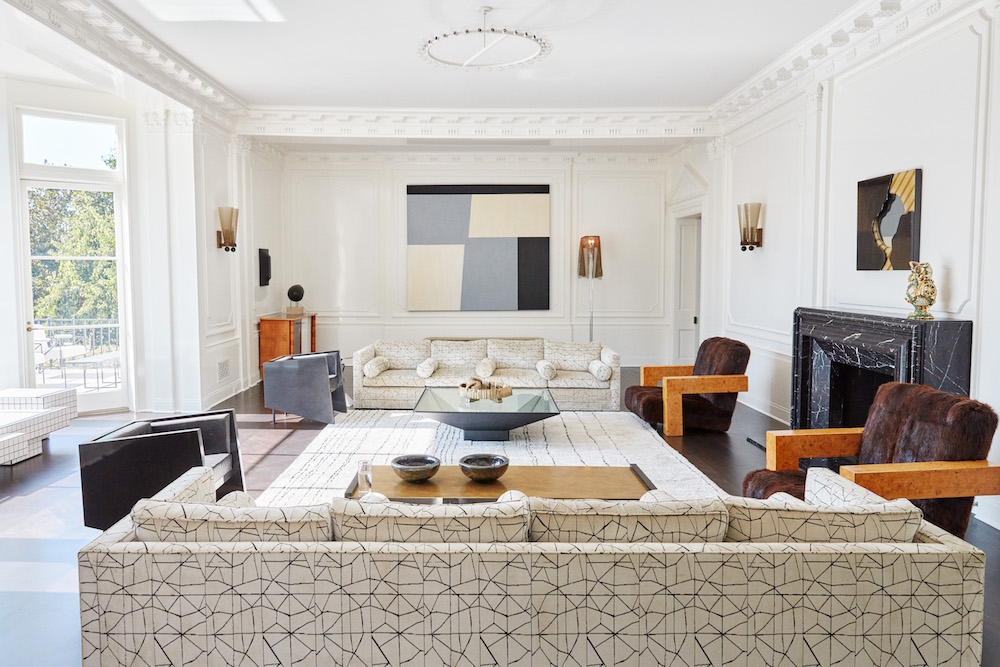

I first came across Kelly Wearstler’s family room in her Masterclass, and it has become one of my favorites. I wanted to analyze why I like it so much, what’s in the room and also what’s not, which makes all the difference.
To begin with, the room is a great size, and the taupe walls are a great canvas. It will comfortably seat 12. I like that there is nothing blocking the fireplace. A surprising number of designs I see have a bench right in front or, worse, part of a giant sofa. While there is symmetry with the couches and chairs, the coffee tables are of different scales and materials, which work for the space and have interesting shapes and legs. The low profile of the sofas and chairs helps make the room look uncluttered. The materials on the chairs are different but work within the color palette and add a lot of interest. The off-white colors of the sofa help with the overall clean look. The black marble fireplace and the traditional ceiling work well together.
The natural light and connection to the outdoors make the room feel airy, literally and figuratively. The wall art is unremarkable in a good way, in that it doesn’t detract from the room or demand attention.
Ok, now the things that are not in the room: Television! Especially a television over the fireplace (no!). There is no giant sectional sofa blocking paths. There are no family photos on the wall! I don’t mind having some photos, just not on the wall!
Kelly’s style is not what I would consider quiet, but this room has a peaceful feel about it.
How do you balance personal touches like family photos with maintaining a clean and clutter-free aesthetic in your own home?


